With technology making way for utmost convenience, the smartphone usage pattern has become complicated to track. Nowadays, people use different devices, such as smartphones, tablets, TVs, desktops, and even smartphones, to access the web. In such a situation, it is essential that your mobile app is responsive enough to adapt to different screen sizes and orientations. According to the latest statistics, responsive design for mobile devices can increase retention rates by 4X compared to those with sophisticated designs. This isn’t just a stat but a fact underscoring the importance of a responsive app.
Table of Contents
Toggle- What Is A Responsive App?
- Key Statistics Showing the Prevalence of Responsive Designs
- Why You Should Invest in Responsive Designs?
- 4 Tried-and Tested Strategies for Developing a Responsive Mobile App
- Best Practices for Creating Responsive Apps for Different Devices
- Conclusion
- FAQs
While it’s true that a majority of online traffic is being contributed by mobile devices but that doesn’t overshadow the prevalence of desktop traffic. However, a responsive app can help you get the best of both worlds. If you think integrating your mobile app with a lot of features and functionalities will keep the users engaged, you might need to re-think.
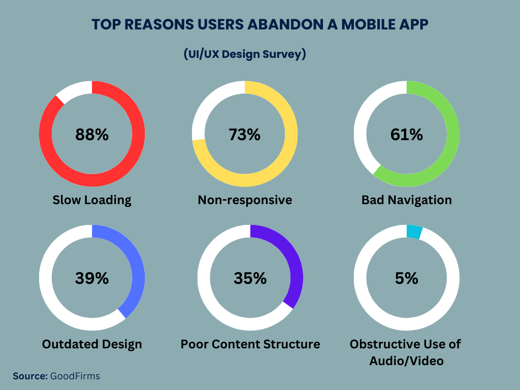
Just imagine a scenario – you downloaded an app and started using it, but it’s too slow to load, even though most of its features are useless to you. So, will you keep it on your devices or delete it? Probably, if you ask me personally, I would delete it, and that’s what stats are saying – an average app lost 90% of its active users within 3 months due to lack of responsiveness, slow loading, and other reasons.
If you’re planning for mobile app development, you might come across this situation sooner or later. However, responsive apps can be your savior, helping you develop an app that meets and exceeds the user’s expectations. So, let’s start this blog to help you understand the role of a responsive app and why it is more important than ever. We will also discuss the benefits of responsive designs and the best practices to implement them effectively.
What Is A Responsive App?
A responsive app or web app is a type of mobile app that offers a seamless user experience across all devices, be it a desktop, mobile, or tablet. A responsible app quickly adapts to the device’s screen size and orientation, making it easy for users to use it regardless of the device they are using.
A responsive web app is well optimized for mobile devices and will always show up in a diverse and fit-to-screen form than its original version. It has fewer elements than a desktop website, providing easy access from anywhere on the screen without the hassle of scrolling down the page.
The ultimate goal of responsive apps is to provide convenience to users in a way that they don’t have to find it challenging to navigate or use the app. However, the main difference between responsive web apps and desktop apps remains the intention behind their development. These apps are designed to work on multiple devices seamlessly.
Responsive web apps are categorized into two broader categories, which include

Adaptive Web Apps
Adaptive web apps, as the name implies, automatically adapt to the mobile device’s screen and orientation. For instance, if you’re viewing it on a smartphone, it will show up on a full screen. On contracty, if you’re wviewing it on a desktop, it won’t display in a full-screen mode, instead it will show up in its default version where you can easily resize it or even zoom on specific area for better viewing experience.
Responsive Web Apps
Responsive web apps are much like adaptive apps, but they differ in a way that they adjust their layout according to the device’s screen size. These web apps boast all the features and functionalities required to access the website with any device.
Want to Hire App Developers for your Project ?
Let’s Discuss →Key Statistics Showing the Prevalence of Responsive Designs
- There were over 7.1 billion smartphone users in 2021, and mobile devices contributed to over 54% of global online traffic. (Source: Hubspot)
- 46% of Americans spend an average of 6 hours on their mobile phones every day. (Source: Hubspot)
- 51% of users prefer mobile phones to browse a mobile site for shopping as they don’t want to download an app. (Source: Hubspot)
- 62% of businesses already have a mobile app, and 42% plan to build one. (Source: Hubspot)
- 73.1% of web designers have admitted non-responsive design to be the first reason why user leaves a web app. (Source: Hubspot)
- 53.8% of web designers underscore the importance of redesigning the web app. (Source: Hubspot)
- Even a 0.1-second reduction in mobile sites results in an 8% increase in conversions and an improvement in bounce rates. (Source: Hubspot)
Why You Should Invest in Responsive Designs?
We live in an era where users’ needs are diverse, and to cater to this, it is crucial to have a responsible design for mobile devices. As said earlier, your mobile app should be able to adapt to different devices, as you never know what type of device your users are using.
According to the latest stats and tips from industry insiders, it is wise to develop an app keeping in mind the responsive design that runs seamlessly on different devices. As the number of mobile users keeps growing at an unpredicted rate, investing in responsive design has become more crucial than ever.
Even Google has admitted that one of the key ranking factors in its search engine algorithms remains mobile-friendliness. That simply means the more mobile-friendly your website will be, the more chances it stands to rank in the Google Search Engine Results (SERP).
Here are some of the benefits of responsive design for mobile devices:
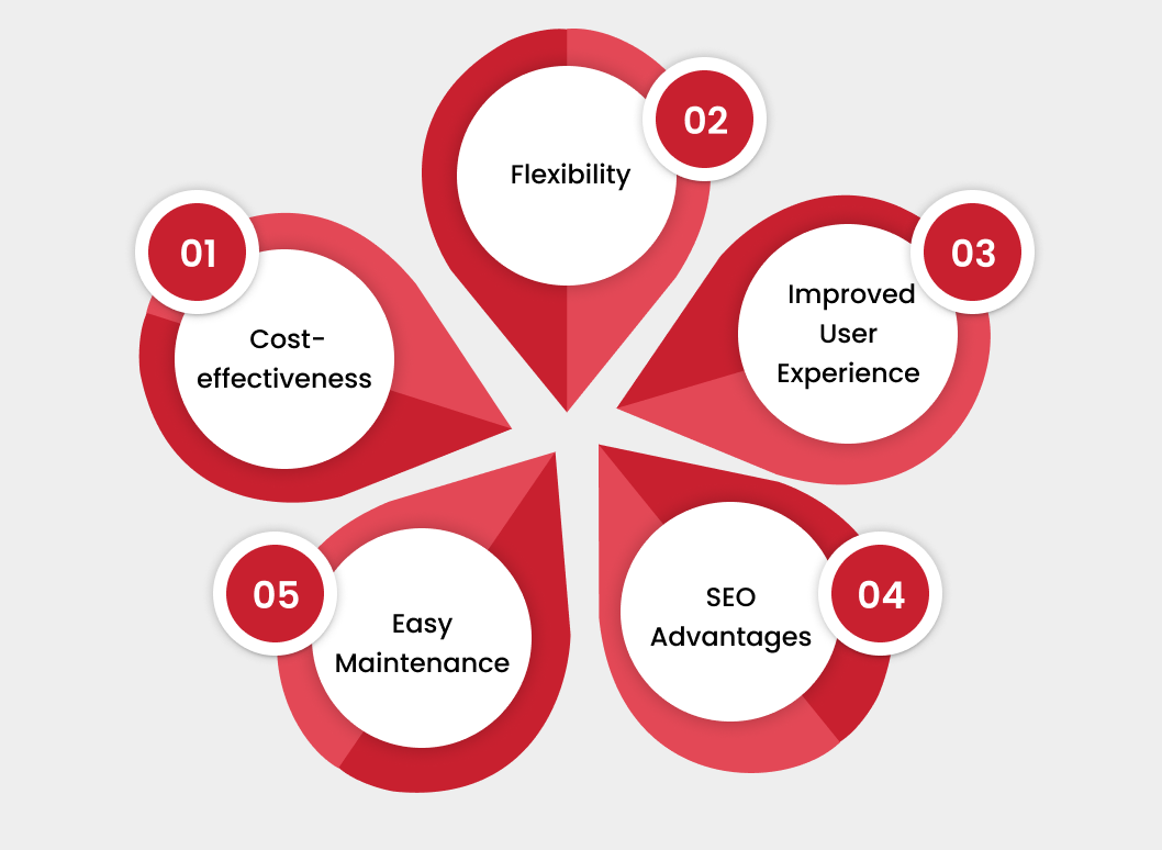
1. Cost-effectiveness
Developing a separate website for your mobile and non-mobile users can be quite expensive. However, responsive apps can solve this problem by providing everything in one place. You will only need to invest in a single web app that will cater to all users, irrespective of their mobile devices.
2. Flexibility
Mobile apps integrated with responsive designs will help you make all changes easily and quickly. As you have a single web app, you don’t have to worry about making changes on multiple sites. The flexibility is probably the most significant advantage, as you can quickly fix any typo or design even only once.
3. Improved User Experience
Users are the most valuable asset for any mobile app owner, and they should be treated the same way. If you want your users to visit your website and ensure they keep coming back, you should not hesitate to invest in responsive design for mobile devices. If your website takes ages to load on a mobile and the images aren’t in the proper resolution, it will make your users believe your company is unprofessional.
And remember, nobody would like to do business with a business that is unprofessional. However, responsive apps offer much more than just a better user experience, which will convince users to give your businesses at least a chance. Here’s a question for you – what would you prefer – a seamless experience across the web page where you can tap anywhere or a hassle to scroll down the page till the need? If you are able to answer this question, you probably won’t ask again whether you should invest in responsive designs or not.
Want to Mobile App Development for your Project ?
Contact Us →4. SEO Advantages
We know how popular and effective search engine optimization (SEO) is for businesses to elevate their position in Google’s search page rankings. The higher you rank, the more likely potential customers will discover you.
Responsive design can be a significant asset for SEO since Google tends to favor mobile-friendly websites. Coupled with other SEO elements, a responsive design can substantially enhance your visibility in search engine results.
5. Easy Maintenance
Many businesses, particularly small-scale ones, struggle to find time to update or revamp their website’s appearance. Responsive design allows them to implement changes swiftly and effortlessly instead of relying on a designer for every website modification.
Moreover, having a single website simplifies various aspects of your marketing efforts. You won’t have to ponder whether to link the mobile or desktop site in a social media post or worry about whether your redirect links are guiding the right visitors to the appropriate site. In essence, a responsive design significantly reduces the complexities of managing a business website.
4 Tried-and Tested Strategies for Developing a Responsive Mobile App
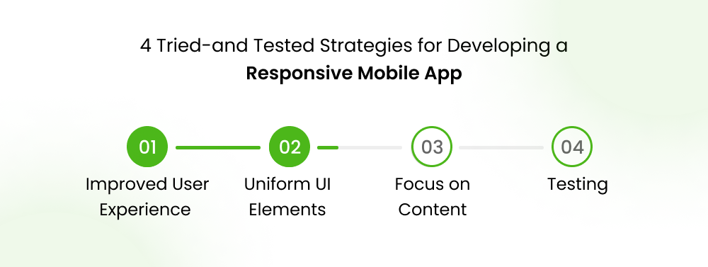
Developing a responsive app isn’t everyone’s cup of tea, and you should treat the process likewise. You should not just hand over your project to anyone; instead, research how efficient the development team is when it comes to creating a responsive app. If everything goes right, remember to keep these below-mentioned strategies in place to keep the mobile app development process going in the way you expect.
Breakpoints
Breakpoints are crucial in mobile app development, no matter whether you go for responsive designs or fully functional ones. They’re provided by Material Design guidelines and refer to the ‘window size classes’ for your app, determining how much screen space your app needs.
Some apps need the full screen, and others only need a part. Due to vertical scrolling, many apps focus on width size classes, allowing them to fit all screen sizes with a few breakpoints.
Uniform UI Elements
Persistent UI elements are vital parts of your native apps, including content, navigation, and the app bar. These elements can be either visible or hidden, but they don’t always have to be visible as long as they exist. They can be used for responsive design, manipulating your screen by taking up full width or height, like a scrollbar. You can manage them using size classes.
Your Success, Our Priority
Turn Your Idea Into Reality
 Talk to Us →
Focus on Content
When it comes to how your content will be displayed on a mobile app, ensure all data should be optimized for different screen sizes. You can design an adaptive screen layout using ViewModel, which is provided by Android Jetpack. These models help to display, hide, or reposition your content. Here are some tips:
- Use a large, scrollable container like ‘RecyclerView’ or ‘ScrollView’ to display more content.
- Highlight important elements like images, videos, graphs, etc., using ‘ConstraintLayout’.
- Expand margins to minimize unnecessary space in your UI.
- Use ‘DrawerLayout’ and ‘BottomSheetBehavior’ to create a supportive panel.
Testing
Testing is vital to checking the responsiveness and performance of your app. You can run tests on physical mobile devices and emulators and even do local testing. Don’t forget about accessibility testing, an essential part of your UI testing.
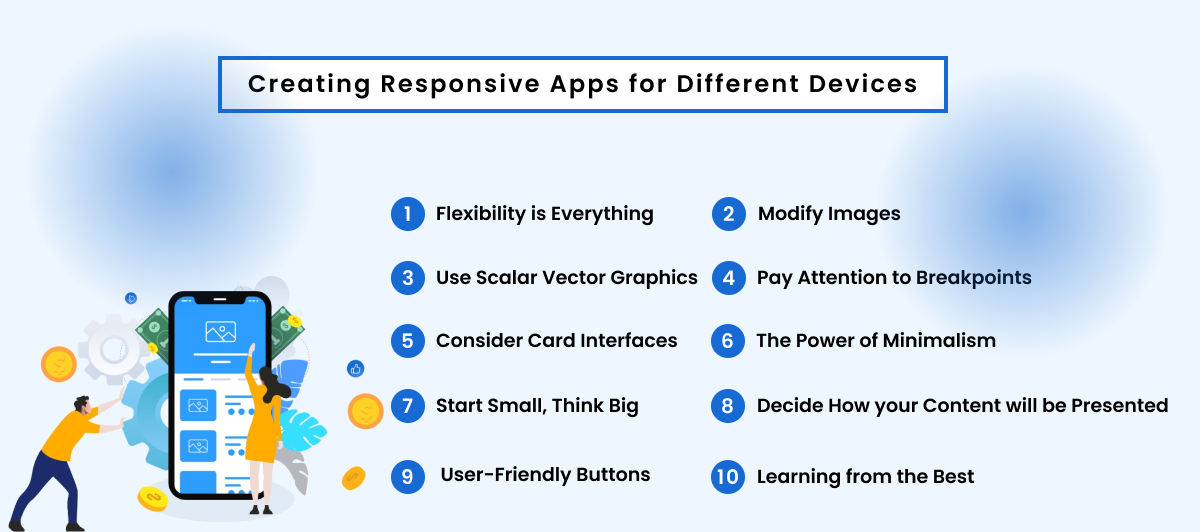
Best Practices for Creating Responsive Apps for Different Devices
Creating a responsive app without following the best practices is something like starting a trip without a ticket.
1) Flexibility is Everything
The flexibility is probably the most significant advantage, as you can quickly fix any typo or design, even only once. This flexibility is not only beneficial for businesses but for users too.
Today, users want everything to go according to their choice, and if your app has all these elements, there’s nothing stopping it from being successful. The layout, images, text blocks, components, and everything else should be responsible and flexible enough to adapt to what users actually need.
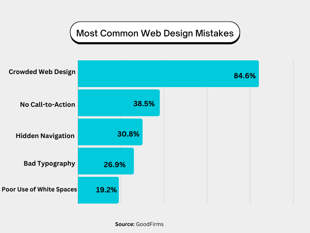
Here are some common web design mistakes you should avoid at any cost:
2) Modify Images
Images work as an engaging element in a mobile app. The more insightful images your app has, the more time a user will like to spend on it.
However, you must optimize these images to adapt to all screen sizes. Mobile phones with smaller screen sizes might require you to crop some images to retain their impact.
3) Use Scalar Vector Graphics (SVGs)
Instead of raster graphics, use scaler vector graphics (SVGs), especially for logos and icons. These graphics formats can easily adapt to image paths with no pixels, which is quite impossible for rater graphics.
4) Pay Attention to Breakpoints
Remember, each web page has a minimum of three breakpoints, i.e., mobile, desktop, and tablet. However, we recommend you work on a minimum of five breakpoints to ensure the highest responsiveness. At the same time, developers should also consider the performance of web apps on different devices (iOS vs Android).
Ready to bring your B2B portal or app idea to life?
Contact Us →5) Consider Card Interfaces
Card UI patterns are nothing but content containers that can be moved easily anywhere, saving you a lot of hassle and time. With tools like UXPin Auto Layout, you can automatically make components more responsive by resizing the cards to fit the screen. The tool works on the flexbox principle that allows developers to copy the CSS during the design process.
6) The Power of Minimalism
Minimalism is key in responsive web design for three main reasons:
- By reducing content, you decrease clutter, making it easier for users to understand and absorb.
- A simple UI design ensures consistency across various devices and screen sizes.
- Web pages with less content and code (HTML, CSS, Javascript) load faster, improving user experience and SEO.
7) Start Small, Think Big
The mobile-first design approach suggests starting with the smallest screen size and scaling up to larger viewports. Designers who start with larger screens often have to remove elements or make compromises when scaling down.
You can learn more about this approach in our free eBook, Responsive & Adaptive Web Design, which includes analysis of major companies like Facebook and Hulu.
8) Decide How your Content will be Presented
Given the limited space on smaller screens, designers need to decide what content remains visible and what can be hidden. A common solution is using a navigational drawer for main navigation on mobile devices.
Designers can also use progressive disclosure to hide non-essential content, resulting in a cleaner, simpler user interface across all devices and screen sizes.
For instance, many eCommerce websites hide size guides using modals, tabs, or accordions to minimize visible content and maintain clean layouts. Users can access these guides by clicking a link.
9) User-Friendly Buttons
According to Fitts’s Law, buttons with larger clickable areas facilitate user interaction. It’s also important to create sufficient whitespace between links and buttons to prevent users from accidentally clicking the wrong one, which can be frustrating!
10) Learning from the Best
One of the most effective ways to stay updated with the latest responsive web design trends is by studying competitors and industry leaders.
For instance, if you’re designing an eCommerce website, consider how global brands like Nike, Asos, H&M, and others design their stores. These brands invest millions in research and testing best practices, so why not use their R&D to your advantage?
Conclusion
After reading this blog, you probably have understood the importance of responsive design for mobile devices. Remember, user experience optimization isn’t just an option left now; it’s actually the need of the hour. By investing in responsive apps, you can cement your chances of being at the top of your competitors.
By focusing on current mobile app design trends, you can enhance user engagement, which translates into increased brand reach and improved conversions. Remember, it is essential to monitor and update your app’s user experience regularly to ensure it runs optimally and seamlessly on different screen sizes and orientations.
As we are concluding this blog, here are some key takeaways to note:
- Responsive design is crucial to cater to a large mobile app user base.
- The fast loading speed can help increase user engagement and reduce bounce rates.
- Responsive apps are best friends for your SEO efforts.
FAQs
What is Responsive Design for Mobile Phones?
Responsive design for mobile phones refers to creating a mobile app that offers a seamless user experience across all devices, be it a smartphone or tablet.
What is the Difference between Responsive and Progressive Apps?
While most people mistake responsive web apps for progressive web app, but they have various differences. A PWA works on enhancing the user experience elements, such as offline capabilities or push notifications, while responsive apps are much more focused on optimizing the display experience.
What is Meant by Responsive and Adaptive Apps?
Responsive and adaptive apps are two main categories of Responsive apps, each serving a different purpose. Adaptive web apps, as the name implies, automatically adapt to the mobile device’s screen and orientation. Responsive web apps are much like adaptive apps, but they differ in that they adjust their layout according to the device’s screen size.
How Much Does It Cost to Develop a Responsive App?
The average cost of developing a responsive app can be anywhere between $5,000 to $10,000. However, the exact app development cost depends on various factors.