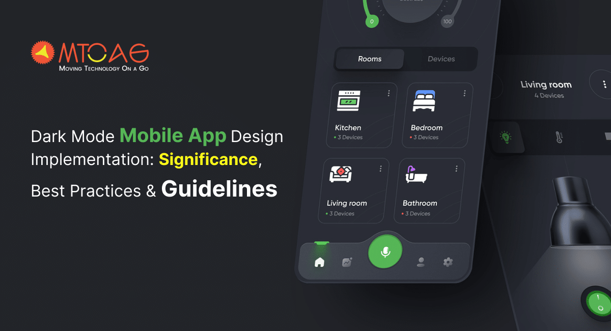
Did you know that a user spends an average of 3 hours and 15 minutes on a mobile phone every day? While it’s just an average, the reality is far from what you think. Most people spend endless time on their mobile phones, be it for any reason, whether it’s about their work, entertainment, or time passing. With so much time spent looking at phone screens, features like dark mode can be a big deal for our eyes and battery life. The dark mode is probably the biggest trend in the mobile app design industry right now, with big sharks like WhatsApp, Instagram, Google, Apple, and Facebook already making the most out of it.
With the official launch of iOS 13 and Android 10, Dark mode entered the mobile app design scene, and it took no time to become the most preferred design feature for users. However, Apple and Android are still making efforts to enhance this feature for maximum convenience. If implemented right, Dark mode offers plenty of benefits to users, including convenient low-light reading, reduced eye strain, and decreased consumption.
Table of Contents
Launched as an optional feature, Dark mode is gradually becoming a thing of consideration for app designers. The challenges of dark mode implementation can’t be ignored, which might affect the entire mobile app development process.
So, to help you out with dark mode app designing and implementation, we present a guide dedicated to the topic. The guide will answer all your potential questions related to dark mode UI design alongside featuring the best practices, tips, and guidelines to implement it for better results. So, let’s get started!
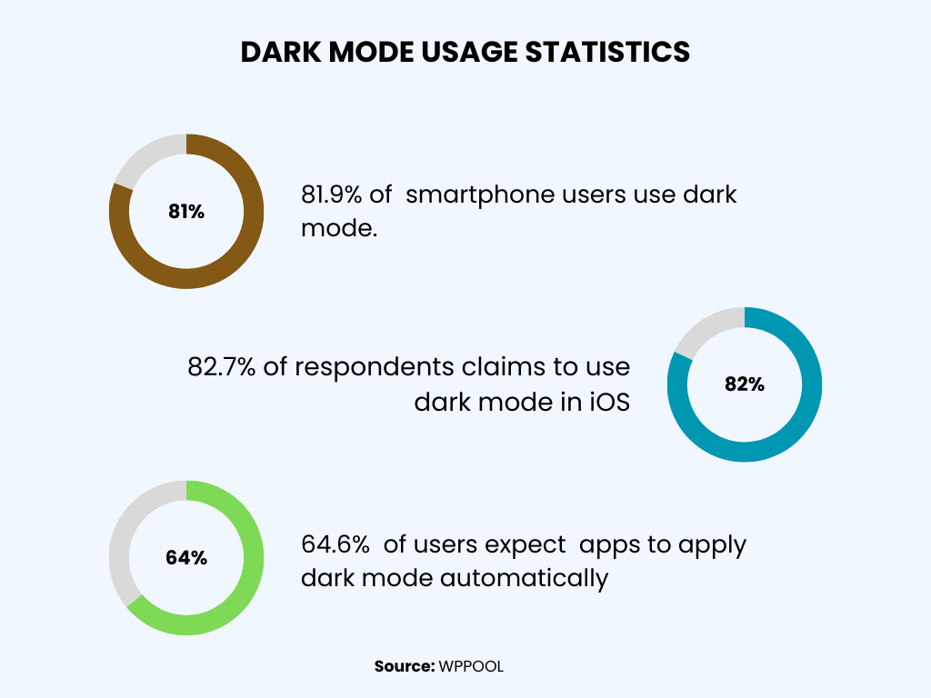
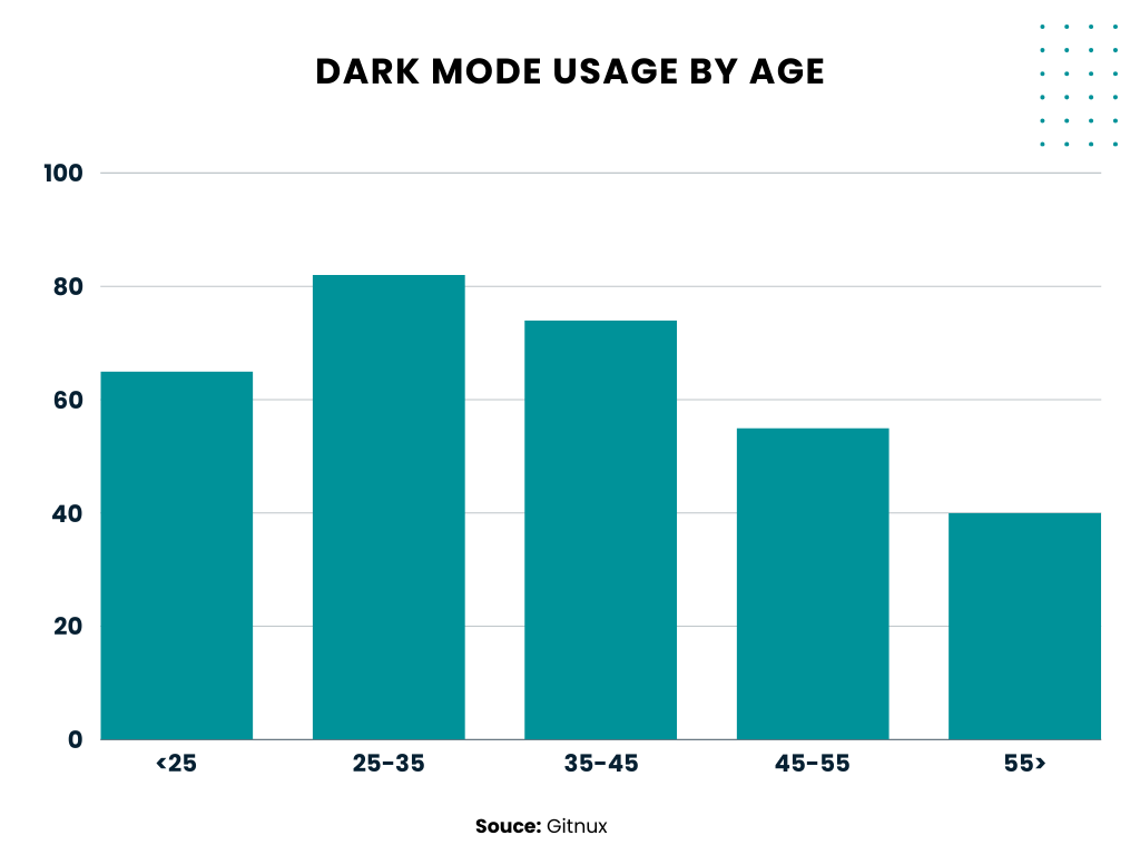
Dark Mode Usage Statistics You Should Know in 2025
- The dark mode usage in smartphones is around 81.9%. (Source: Forms.app)
- Studies have shown the dark mode can save up to 65% of battery life on AMOLED screens. (Source: Night Eye)
- According to a recent study, dark mode in Android apps can save up to 58.5% on display battery consumption. (Source: The Small Business Blog)
- Users with prefer dark mode settings contribute to 22% of web traffic in 2021. (Source: Web.dev)
- Dark mode is being used by 81.9% of Android users. (Source: LinkedIn)
What Is Dark Mode?
Dark mode is a display setting in mobile phones controlled by the user. It includes changing the display setting to a light color text (often grey or white) showing up against a dark screen instead of normal light mode, which includes displaying the dark black text on a light screen.
However, literally every phone comes with light mode as the default display setting. The dark mode is also known as:
- Dark theme
- Black mode
- Night mode
- Light-on-dark
The concept behind implementing a dark mode is to reduce the striking light emitted by the screen while keeping the color contrast ratio at a minimum for maximum readability.
While Android and iPhone smartphones come with an in-built dark mode setting, you still need to set it up according to your preference.
Not just mobile phones, several desktop systems also offer dark mode, allowing users to adjust the display setting. So, here comes the big question: Is it the best time to invest in dark mode design? Let’s find out in our next section.
Benefits of Dark Mode Design Implementation
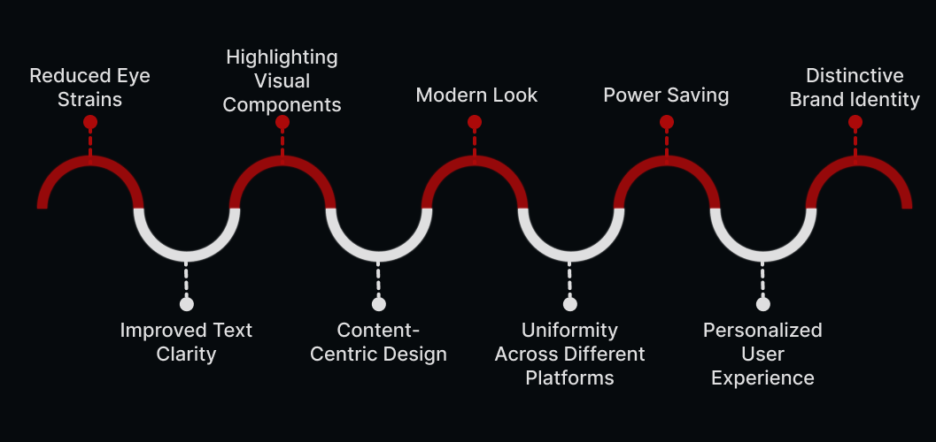
There is a reason behind the immense popularity of dark mode among smartphone users. Even many smartphone users prefer to use only dark mode on their devices. So, it’s undeniable how dark mode has been impacting the app design.
Before implementing dark mode in mobile app development, here are some potential benefits to consider:
1. Reduced Eye Strains
The dimmed interface of dark mode can help decrease eye strain, especially in environments with poor lighting. If your app integrates a dark mode setting, there are higher chances of it getting a good response.
2. Improved Text Clarity
White or light-colored text against a dark backdrop often offers superior contrast, enhancing the readability of the text. This is particularly beneficial for apps that are text-heavy, like news apps, blogging platforms, or chat applications.

3. Highlighting Visual Components
Visual components such as images, icons, and buttons become more noticeable in dark mode due to the increased contrast. This makes it easier for users to spot and interact with key elements on the screen, leading to a more user-friendly and intuitive design.
4. Content-Centric Design
A dark mode shifts the focus toward the content on the screen. This is especially useful for apps that are centered around content consumption, like video streaming services or photo-sharing platforms, as it reduces distractions and allows users to concentrate on the content.
5. Modern Look
Dark mode is often associated with a modern and stylish aesthetic. By integrating dark elements into your app’s design, you can project a sense of elegance and keep your app in line with current design trends.
6. Uniformity Across Different Platforms
A multitude of operating systems and widely-used apps are now integrating dark mode as a standard feature. By integrating dark mode into your app, you’re ensuring a uniform user experience across different platforms. This makes your design feel cohesive and familiar to the users.
7. Power Saving (Specifically for OLED/AMOLED Screens)
Dark mode can significantly save battery life, particularly on devices equipped with OLED or AMOLED screens. These types of screens illuminate each pixel individually, and displaying darker colors requires less energy. This not only potentially prolongs the battery life for the user but also promotes eco-friendly design practices.
8. Personalized User Experience
Offering dark mode as an option allows users to tailor their experience based on their personal preferences or environmental conditions. This degree of personalization can boost user satisfaction and engagement with your app.
Want to Hire Website developers for your Project ?
9. Distinctive Brand Identity
Dark mode can serve as a distinctive design element that differentiates your app from its competitors. If implemented effectively, it can enhance brand uniqueness and make your app more memorable to users.
As seen through the benefits, it is clear that dark mode can positively influence app design by enhancing readability, emphasizing content, augmenting visual elements, and contributing to a modern and sophisticated aesthetic. When thoughtfully implemented, dark mode can be a crucial component in crafting a visually attractive and user-friendly app design.
Best Practices for Designing Dark Mode for iOS and Android
Ever since the launch of dark mode, it has counted among the most requested features in a mobile app. That’s not; Google and Apple have even made the dark theme a crucial part of their device’s UI/UX. As you have learned the benefits of implementing a dark mode, integrating it into the app’s UI isn’t a simple process.
For the implementation of dark mode UI design, you must follow a set of best practices for maximum effectiveness. So, here’s a dark mode design best practices checklist for beginners:
#1. Avoid Using Pure Black Color
A dark theme shouldn’t simply be white text on a black background. This high contrast can be hard on the eyes. When implementing a dark mode in your app, it’s best to use dark grey as the main color for dark mode elements. This reduces eye strain and makes shadows more visible than on a black surface.
Want to Mobile App Development for your Project ?
#2. Limit Saturated Colors in Dark Themes
Saturated colors that look appealing on light surfaces can clash with a dark background, making text hard to read. Opt for lighter tones that are easier to read and don’t make the user interface overly vibrant, thus preventing unnecessary eye strain.
#3. Consider the Emotional Impact of Your Design
When creating a dark theme for your app, you might be tempted to replicate the emotional impact of your light theme. However, this isn’t advisable as different colors evoke different emotions. Your dark mode colors will create a different emotional response. Establishing a consistent emotional tone across both theme interfaces is essential.
#4. Test the Design in Both Light and Dark Modes
Your users will likely switch between the light and dark themes throughout the day. Therefore, it’s crucial to assess your app’s performance under varying lighting conditions by testing it at different times of the day. This will ensure it meets your standards.
#5. Integrate Dark Mode into Graphics and Animations
If your app includes animations or extensive graphical elements, you’ll need to adapt them for the dark theme. If an illustration has a subject and a background, consider desaturating the background colors to maintain focus on the subject.

#6. Adhere to Color Contrast Standards for Accessibility
Make sure your content remains easily readable in Dark Mode. The surfaces of the dark theme should be dark enough to display white text. Google Material Design suggests a contrast ratio of at least 15.8:1 between the text and the background. Use color contrast tools to verify this ratio.
#7. Avoid Simple Color Inversion
The original theme might provide valuable visual cues when transitioning from a standard to a dark mode. Don’t just invert the colors, as this could turn meaningful colors into bland tones. Be deliberate about the colors you choose.
#8. Choose Appropriate “On” Colors
‘On’ colors appear on key surfaces and elements and are typically used for text. For a dark theme, the default ‘on’ color is pure white. However, this bright color can create visual vibrations against dark backgrounds. Therefore, Google Material Design recommends using a slightly darker shade of white.
- Disabled text should have 38% darkness.
- Medium-emphasis text 60%
- High-emphasis text 87%.
Ready to bring your B2B portal or app idea to life?
#9. Get Deeper
The higher a layer is, the lighter it should be. This creates a visual hierarchy in dark mode that ranges from the most frequently used elements on your screen to the least.
Now that you’re equipped with all the knowledge needed to design the dark mode version of your app, the next step is to consult with a team of experts who have implemented this UI in their applications. This will bring you one step closer to providing a pleasant experience for your end users.
Guidelines for Dark Mode Design Implementation
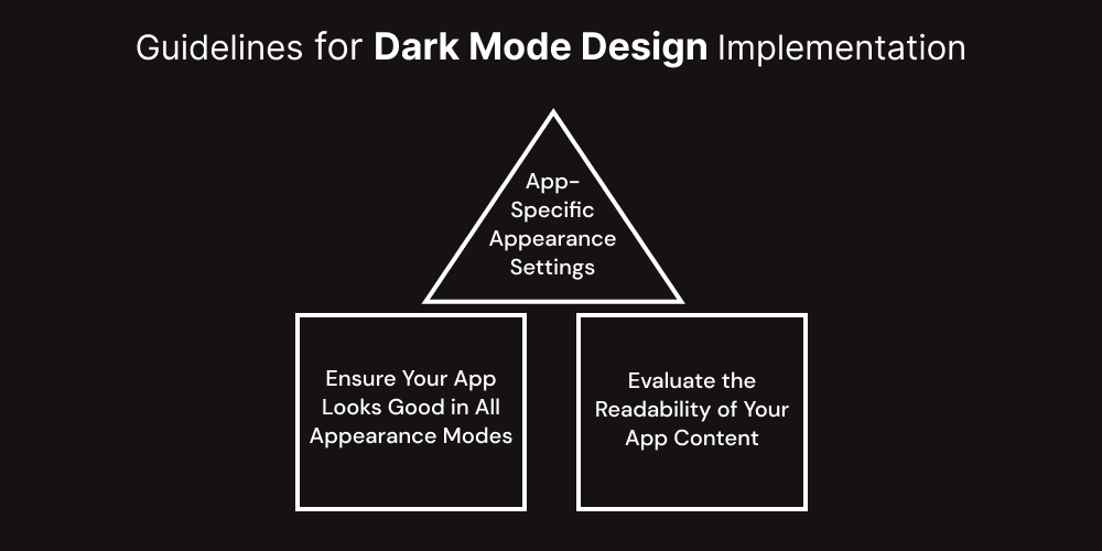
Designing the dark mode UI requires mobile app designers to follow a set of guidelines, which are based on three main principles, including –
App-Specific Appearance Settings
Having an appearance setting specific to your app can lead to extra work for users as they might need to tweak multiple settings to achieve their desired look. What’s even worse is the user might perceive your app as faulty if it doesn’t align with their system-wide appearance preference.
Ensure Your App Looks Good in All Appearance Modes
Users have the option to select the Auto appearance setting, which alternates between light and dark modes based on the time of day. This could happen while your app is in use, so it’s crucial that your app maintains its aesthetics in both modes.
Evaluate the Readability of Your App Content
Verifying that your content remains easy to read in both light and dark modes is essential. For instance, when using Dark Mode with Increase Contrast and Reduce Transparency enabled (either individually or together), you might encounter instances where dark text on a dark background is hard to read.
Activating Increase Contrast in Dark Mode might also lead to a decrease in visual contrast between dark text and a dark background. While users with good eyesight might still manage to read text with low contrast, it could be unreadable for many others. For more information, refer to the section on Color and Effects.
How to Implement Dark Mode for An Android App?
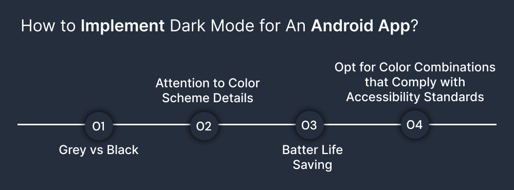
If you’re designing a dark mode UI for Android devices, then there’s great news for you! Google has detailed documentation support for designers to understand the dark mode UI design. This document is based on four design principles, including
#1. Grey vs Black
The first thing you should think about while implementing the dark mode in UI design is that the standard backdrop for the app shouldn’t be black but a deep grey: #121212. There’s been a lot of debate about why we opted for grey over black, particularly since Android 10’s platform uses a black backdrop. This is primarily a balance between usability and energy efficiency.
The platform uses a pure black #000000 color as the background, which allows system applications and surfaces to consume as little power as possible when they’re open on OLED displays. These system surfaces are usually quite basic, often just text and simple icons, so we can modify the text and icon colors to combat contrast issues.
However, the app surfaces can contain a variety of elements: intricate, colorful vector animations, vivid images, contrasting branded surfaces, and much more. Setting these against a pure black background results in much higher contrast, which can lead to eye strain. Therefore, using a light-colored or grey background is the solution.
#2. Attention to Color Scheme Details
When it comes to color scheme details in a dark UI, Google suggests using limited color accents in dark theme UIs, so most of the space is dedicated to dark surfaces. Keeping the dark background deepens the visuals of the photos and creates a pleasing contrast with the accent color.
Using split complementary colors can be beneficial. This scheme has one dominant color and two colors adjacent to the dominant color’s complement. This provides the necessary contrast without the tension of the complementary color scheme.
#3. Batter Life Saving
Dark themes decrease the luminance emitted by device screens while still meeting minimum color contrast ratios.
They help improve visual ergonomics by reducing eye strain, adjusting brightness to current lighting conditions, and facilitating screen use in dark environments – all while conserving battery power.
Devices with OLED screens benefit from the ability to turn off black pixels at any time of day or by reducing the use of light pixels.
#4. Opt for Color Combinations that Comply with Accessibility Standards
To cater to regular users of the dark theme, such as those with low vision, it’s crucial to adhere to the color contrast standards of accessibility. Google Material Design Guidelines have established certain properties for the dark color scheme and overall mode:
Elevation
When designing a dark theme, the components maintain the same default shadow components and elevation levels as in the light theme. The difference lies in the illumination of the surface of elevation levels.
The higher the elevation level of a surface, the lighter the surface appears. This lightness is demonstrated through the application of semi-transparent overlays. These overlays also enable differentiation between components and visibility of shadows.
Accessibility & Contrast
The background in dark theme UI design should be sufficiently dark to display white text. A minimum contrast of 15.8:1 between the background and text should be maintained. This ensures that the body text meets the WCAG’s AA standard of 4.5:5:1 when applied to surfaces at the highest elevation.
Colors
Designers should prioritize using desaturated colors as they enhance legibility. The selection of primary and secondary colors should also take into account both light and dark UI themes.
Light Text on Dark Backgrounds
When light text is displayed on a dark background, the following opacity levels should be observed:
- High-emphasis text should have an opacity of 87%
- Medium-emphasis text and hint text should have opacities of 60%
- Disabled text should have an opacity of 38%
States
States use overlays to convey the status of interactive elements for dark theme layouts or components. They should use the same overlay values as the default light theme in a dark theme. Two types of containers inherit the state overlays: Surface and Primary.
Surface containers that use the Surface color should apply an overlay that matches the color of the text or icon. For surface containers that use the Primary color, the state overlay should be white.
How to Implement Dark Mode in iOS App?
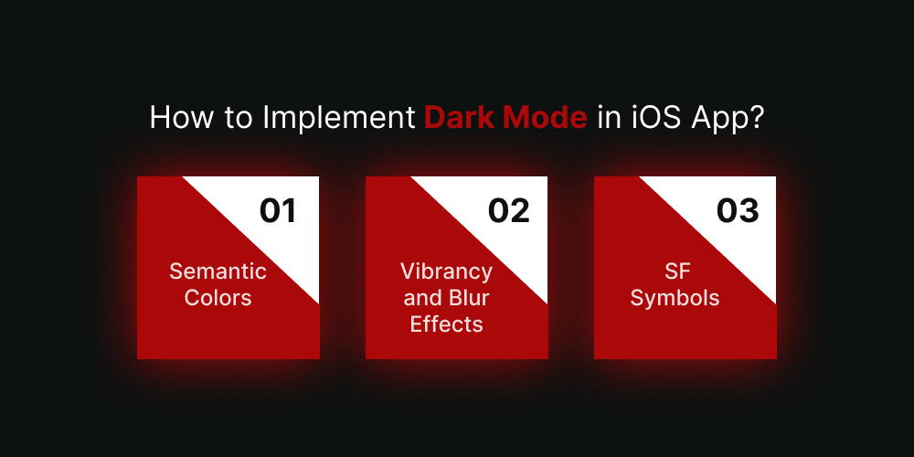
The introduction of dark mode has led to a rethinking of UI styling and colors in iOS. Here are the fundamental changes that Apple has implemented to facilitate designing for dark mode on iOS 13:
#1. Semantic Colors
Apple has introduced semantic colors for frequently used UI elements to harmonize the look and feel of iOS apps in both light and dark modes.
These colors don’t necessarily have the optimal RGB value; they instead directly alter the iOS interface style. In dark mode, these semantic colors are particularly useful for managing overlay color and text.
System Colors
There are nine predefined system colors in iOS that are compatible with the dark system-wide appearance and are dynamic. As a result, these colors adapt to the selected interface styles.
#2. Vibrancy and Blur Effects
With the launch of iOS 18, Apple has added 4 blur effects and 8 vibrancy effects that automatically adjust to the iOS interface style.
Apple has also added 4 vibrancy effects to the iOS dark mode typography suite: 3 for overlays and 1 for separators.
#3. SF Symbols
Apple’s Human Interface Guidelines provide a library of over 1500 symbols for product developers and designers to incorporate into their apps. These symbols are optimized for both light and dark UI, so they automatically look great in Dark Mode.
Conclusion
With this guide, you probably have learned everything about dark mode design implementation. There’s one more thing to remember: dark mode isn’t just a trend that will fade away but an essential feature that will continue to refine the mobile app design industry for years to come.
As far as the benefits of dark mode UI design are concerned, it is the best time to integrate your app with such a helpful and valuable feature. And the next step is to talk to an expert mobile app designing company like Mtoag Technologies and get a real view of the significance of UI designing in mobile app development. It is probably the best way to get closer to achieving your end goals by offering a seamless viewing experience to your users.
Want to know more about dark mode designing and implementation? Book a free consultation with our expert mobile app designers now!